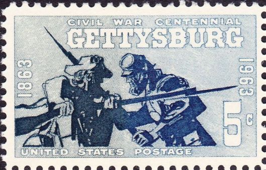
The name Roy Gjertson did not mean anything to me until earlier today, after reading this U-T San Diego piece that happened across my in-box. As it turns out, the now eighty-seven year old Californian was the designer of the 1963 Gettysburg centennial stamp pictured above. It is one of the great stamps of the 1960s and not something I ever considered particularly controversial.
Along with a thousand or so other graphic artists, Gjertson entered the design competition and then waited to see what happened. He had been preparing for awhile, in particular by reading the works of Centennial doyen Bruce Catton. The stamp really works. For one thing the colors, blue and grey, are right. Inexplicably, the GAR and UCV stamps issued in 1949 and 1951, respectively, are red and grey. It is also cinemagraphic, capturing the intensity of the July 1863 fighting in dramatic fashion. The scene just . . . flows.
So why the controversy? It turns out some folks got pissed because the blue shading takes up more than half the stamp, therefore slighting the Cause. Objectors also did not like what they interpreted as Johnny Reb’s disheveled look in relation to Billy Yank’s cleaner and better accoutered appearance. Topping the imbroglio off was that the Post Office published Gjertson home address, the better for people to write for autographs. Instead, what he got was an earful from those who chose to be angry. Judging from the glint in his eye, he looks like the type who would take such controversy in stride.
(image/US Post Office)


And that’s even before Facebook!
I realize I should know better by now, but it never ceases to amaze me what people will allow themselves to get worked up about when it comes to the Late Unpleasantness.